

Customer Churn Prediction using Machine Learning
In the current scenario, wherein the global pandemic has marginalized end customer spend, and thereby throttled revenues, it is imperative for businesses, especially those based on subscribers to be able to predict the possible customer churn or attrition, and plan thereafter on corrective actions or early red flags.
At Citrus Consulting, we endeavor to help our customers, solve business problems whilst leveraging modular future ready technologies. In lieu of the same, we have leveraged our team of advanced analysts and consultants, and developed an out of the box customer churn prediction model, to help our customers across regions to plan their marketing and reach out endeavors strategically with quantifiable business output.
Customer Churn is also known as customer attrition refers to customer or subscriber stop doing business with company or services. A business typically treats a person as churned once a specific amount of time has passed since the customers last interaction with the company or service.
Customer churn is one of the major and most important problem for large companies. Especially in Telecom industry customer will not hesitate to leave if they don’t find what they are looking for. Customer want competitive pricing, high quality service and value for money. Customer churning is directly proportional to customer satisfaction. The cost of churn includes both lost revenue and the marketing costs involved with replacing those customers with new ones. It’s a known fact that the cost of customer acquisition is far greater than cost of customer retention, that makes retention a crucial business prototype.
In this blog post, we will create a model which predicts if a customer is likely to churn using open source Telecom data and Python.
Build your own Churn Prevention Model
In order to enable our customers and end users, here are a few steps to help you build your own churn prevention model. Reach out to us for further customization and use cases.
Step 1 - Import Libraries to Build Model
###Importing the required Libraries
import pandas as pd
import numpy as np
import matplotlib.pyplot as plt
import os
import pickle
import seaborn as sns
from sklearn.externals import joblib
from sklearn.preprocessing import MinMaxScaler
from sklearn.model_selection import train_test_split
from sklearn.linear_model import LogisticRegression
from sklearn.tree import DecisionTreeClassifier
from sklearn.neighbors import KNeighborsClassifier
from sklearn.discriminant_analysis import LinearDiscriminantAnalysis
from sklearn.naive_bayes import GaussianNB
from sklearn.svm import SVC
from sklearn import model_selection
from sklearn.model_selection import KFold
from sklearn.metrics import accuracy_score
from sklearn.metrics import confusion_matrix
from sklearn.metrics import classification_report
import sklearn.metrics as metrics
import warnings
warnings.filterwarnings("ignore")
%matplotlib inline
Step 2 - Get Data
You can get the data from many websites which is publicly available like Kaggle. Load the data and store it into dataframe.
Telco_data=pd.read_csv(‘TelcoCustomerChurn.csv') #rLoading the data to datafrmae
Telco_data.head() #See the first five rows of dataframe

Step 3 - Exploratory Data Analysis
Telco_data.shape #gives the number of rows and columns

Data frame contains 7040 rows and 21 columns.
Telco_data.columns #show all the columns in the dataset

Now check if any missing values are there
Telco_data.isna().sum() #gives the missing values

As there are no missing values, we will check the descriptive statistics of the numerical columns.
Telco_data.describe() #Give the statistics of the data

From the above table we can see the average tenure of the customer is ~32 Months and monthly charges are ~$65. Now we can see the distribution of labels (churned and not churned).
# Plotting target feature distribution
count = Telco_data['Churn'].value_counts(sort = True)
colors = ["grey","orange"]
labels=['No','Yes']
#plotting pie chart
plt.pie(count,labels=labels, colors=colors,autopct='%1.1f%%', shadow=True)
plt.title('Churn Percentage in data')
plt.show()
From the above graph 73.5% of the customers are retained and 26.5% of customers are churned. Plotting the relation of target attribute with other independent variables:
sns.countplot(x ='TechSupport', hue = "Churn", data = Telco_data)
sns.countplot(x ='InternetService', hue = "Churn", data = Telco_data)
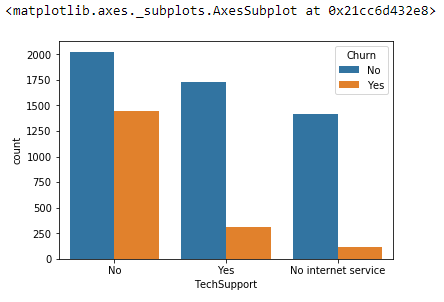

The charts above tell us that people who don’t have tech support are churning a lot compare to other categories. And, People with Fiber Optic internet rate of churning is high. Based on this the company might stop providing Fiber optic internet or improve the service. Now we will see how some of the numerical attributes that are responsible for churn:
data['TotalCharges']=pd.to_numeric(data['TotalCharges'],errors='coerce')  #Convert string to numeric
features = ['MonthlyCharges', 'tenure','TotalCharges']
fig, ax = plt.subplots(1, 3, figsize=(15, 4))
Telco_data[Telco_data.Churn == 'No'][features].hist(bins=20, color="grey", alpha=0.9, ax=ax)
Telco_data[Telco_data.Churn == 'Yes'][features].hist(bins=20, color="orange", alpha=0.9, ax=ax)

From the above graph we can clearly say that customers paying monthly charges greater than $70 has tendency to churn. So, we can recommend to the company to reduce the monthly charges to retain the customers.
From tenure chart, customers whose tenure is between 0 to 10 months had churned a lot. The customer whom we retained most of their tenure is greater than 2 years. So, the company must try different offers/services to keep the customer for at least 2 years
Step 4 - Data Preprocessing
After data analysis now we will do data cleaning and prepare the data suitable for the algorithms that we are going to use. First step is to remove unnecessary columns from the dataset, and then convert the datatypes to numeric.
Customer Id will not add any value to the model, so we can remove that column from the data for now. Later based on the importance of the feature we can remove some more features.
#create a copy od dataset to clean the data
clean_df=Telco_data.copy()
#remove customer ID column from the dataset
Clean_df. drop('customerID',axis=1,inplace=True)
#to check the data datatypes
Clean_df.dtypes
Converting string features to numerical features
Columns=clean_df.columns.values #to get all column names
For column in columns:
if clean_df[column].dtype=='object':
   clean_df[column] = clean_df[column].astype('category')
   clean_df[column] = clean_df[column].cat.codes
else:
   continue
clean_df.head()
Create a new variable for independent features and new variable for target
features=clean_df.drop('Churn',axis=1)
Y=clean_df['Churn']
Now we need to normalize the data because multiple features in dataset spanning varying degrees of magnitude, ranges.
scaler = MinMaxScaler(feature_range=(0, 1))
features = scaler.fit_transform(features)
The data is normalized and in the ready to use format by the algorithm. Before training we need to split the data in to train and test datasets. We can split the data in to 80:20, 80% training dataset and 20% testing dataset.
X_train, X_test, y_train, y_test = train_test_split(features,Y, test_size=0.2)
print (X_train.shape, y_train.shape)
print (X_test.shape, y_test.shape)

Step 5 - Model Training
models = []
models.append(('LR', LogisticRegression()))
models.append(('LDA', LinearDiscriminantAnalysis()))
models.append(('KNN', KNeighborsClassifier()))
models.append(('CART', DecisionTreeClassifier()))
models.append(('NB', GaussianNB()))
models.append(('SVM', SVC()))
The data is normalized and in the ready to use format by the algorithm. Before training we need to split the data in to train and test datasets. We can split the data in to 80:20, 80% training dataset and 20% testing dataset.
results = []
names = []
scoring = 'accuracy'
for name, model in models:
    kfold = KFold(n_splits=10, random_state=42)
    cv_results = model_selection.cross_val_score(model, X_train, y_train, cv=kfold, scoring=scoring)
    results.append(cv_results)
    names.append(name)
    msg = "%s: %f (%f)" % (name, cv_results.mean(), cv_results.std())
    print(msg)

In the above block of code, we have applied 10-fold cross validation and pass the train data to all the algorithms and stored the accuracy of each iteration of training data of all algorithms in to ‘results’ list. Finally printed the average accuracy of all the models.
fig = plt.figure()
fig.suptitle('Algorithm Comparison')
ax = fig.add_subplot(111)
plt.boxplot(results) #results of 10 iterations of each model
ax.set_xticklabels(names)
plt.show()
From the above figure we can clearly say Logistic Regression, LDA performed better on this dataset. For now, we will use Logistic Regression to check how it works on the test dataset and generate different accuracy metrics
logreg = LogisticRegression() #Create the model
log_model=logreg.fit(X_train,y_train) #fit the training data to the model
print(log_model)

Step 6 - Accuracy Metrics
In the above image you can see what all the parameters that we used for training the model. You can change some of the factors and check if the accuracy is increasing.
predicted_classes = log_model.predict(X_test) #predicts the test dataset class labels of each sample
predicted_prob=log_model.predict_proba(X_test) #predicts the probability of each sample in the test data
print(classification_report(y_test,predicted_classes)) #to get the accuracy metrics
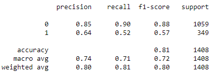
From the above picture you can see that we have 90% recall, 85% precision and 81% accuracy. We can still increase model accuracy by tuning some of the hyperparameters and by removing or adding the features.
We will plot ROC curve to check at which threshold we will get good recall and what is the ideal threshold to choose.
y_pred = []
#for row in predicted_prob:
y_pred.append(row[1])
y_pred = np.array(y_pred)
# calculate the fpr and tpr for all thresholds of the classification
fpr, tpr, threshold = metrics.roc_curve(y_test, y_pred)
roc_auc = metrics.auc(fpr, tpr)
#plotting the curve
import matplotlib.pyplot as plt
plt.title('Receiver Operating Characteristic')
plt.plot(fpr, tpr, 'b', label = 'AUC = %0.2f' % roc_auc)
plt.legend(loc = 'lower right')
plt.plot([0, 1], [0, 1],'r--')
plt.xlim([0, 1])
plt.ylim([0, 1])
plt.ylabel('True Positive Rate')
plt.xlabel('False Positive Rate')
plt.show()
From the above curve we can seat 0.6 we have high True Positive Rate and less false positive rate. Let’s use this threshold and create a confusion matrix and see how the recall and precision is.
prediction = np.where(y_pred > 0.6, 1, 0) #using 0.6 as threshold to classify the label
f_mat = confusion_matrix(y_test, prediction)
df_cm = pd.DataFrame(f_mat, range(2),range(2))
sns.set(font_scale=1.4)#for label size
sns.heatmap(df_cm, annot=True, fmt='d')
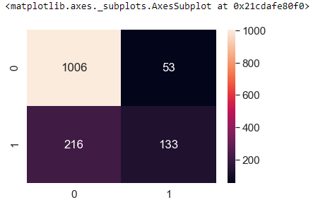
True Negatives: Actual Not Churn Predicted Not Churn = 1006
False Positive: Actual Not Churn Predicted Churn = 216
False Negative: Actual Churn Predicted Not Churn = 53
True Positive: Actual Churn Predicted Churn = 133
Now we need to decide which is important to us, in this use case False negatives are costly so we need to make sure our Recall is more, to increase the recall you can increase the threshold.
We can still increase the accuracy and recall by creating new features or deleting some of the correlated features and we can experiment with hyper-parameters


